_
Project
B.blend is a Whirlpool (Brastemp) & Ambev's joint venture that built an all-in-one beverage machine. Well known by the machine and more than 34 flavours in 10 categories of drinks in capsules and water purifier.
Challenge: B.blend - Brastemp, a big account at Agência 242 with many responsibilities and challenges like projects with different goals yhat need keeping in mind the visual identity, creative, useful, efficient, aesthetically appealing perspectives in a retail path.
Role: Graphic Design | Motion Graphic
_
Cyber Monday
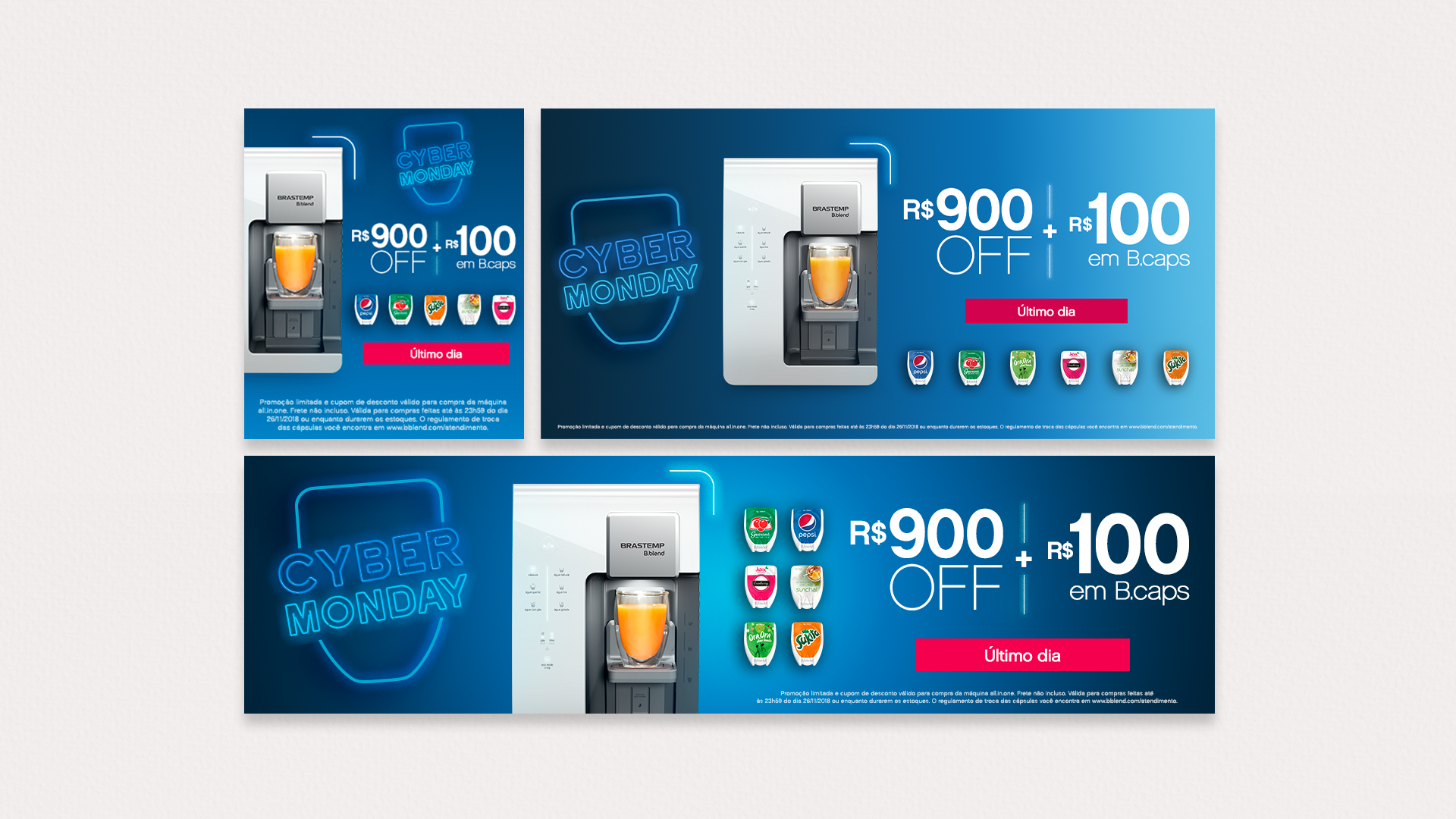
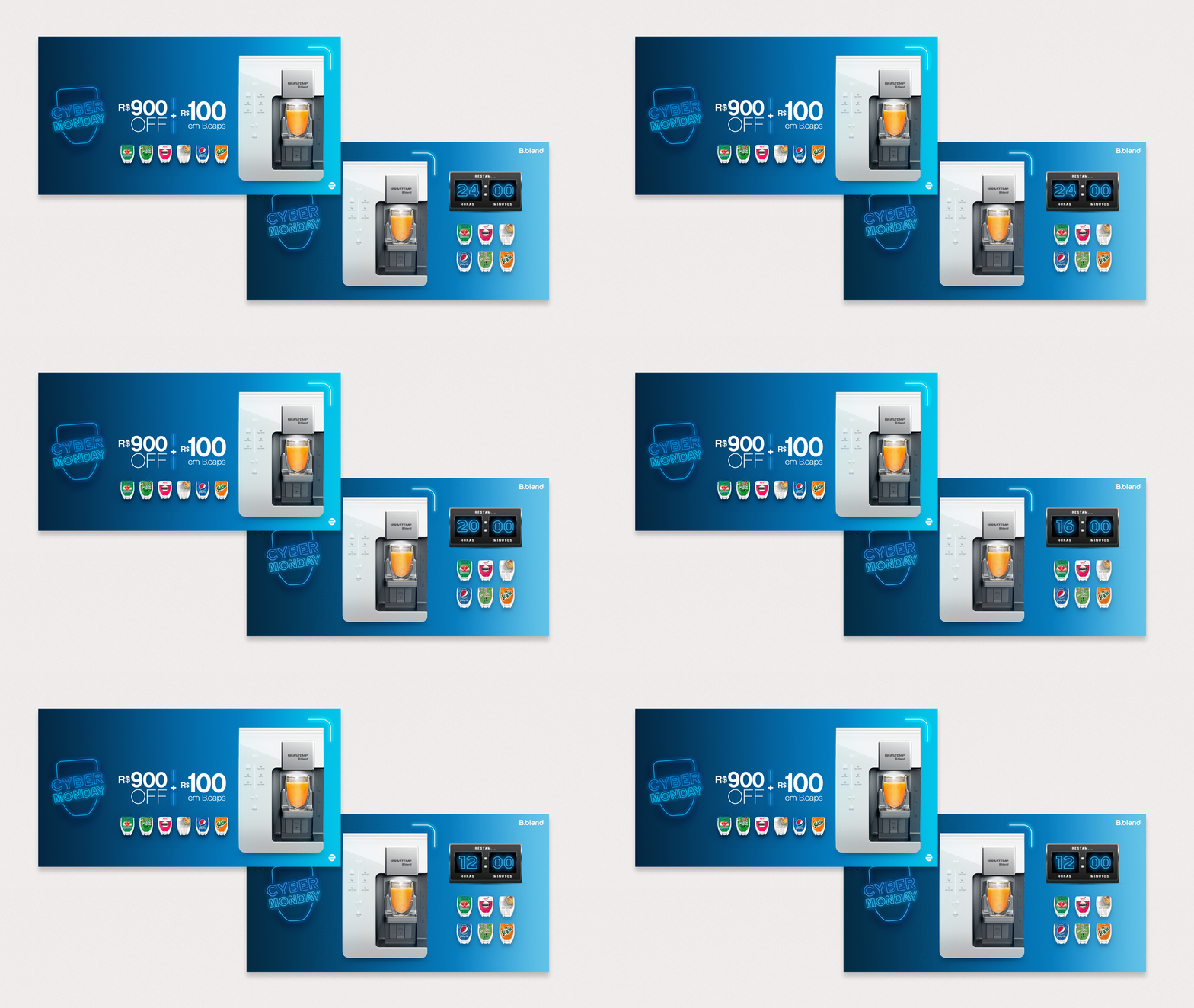
We made a big Black Friday's campaign, then to fallow it Cyber Monday came in a bit more simple way, with bright colours in the gradient, keeping the neon to align to the campaign before. Cyber Monday’s proposal, after Black Friday, has an inverse idea of the principal campaign. While the layouts of Black Friday follow the name and it is black and pink, the principal colour of the brand, Cyber Monday brought the idea of light on, new opportunities and technology, as it's a promotion that has emerged in e-commerce.
Thus, the blue gradient, the second colour of the brand, was worked together with the brand’s traditional shape and the neon, as a fixed element in the different formats. Besides that, we used a countdown arouse the consumer's sense of urgency and then achieve the campaign goals.
How it was just online and for one day, we changed the site's banners, did AD on Facebook and email marketing. I desired a fresh and clean graphic.


_
Member Get Member
Member get member is a B.blend’s program for friends indication, in which a consumer refers to a friend, and upon completing the first buy, eath one of them wins a voucher with the value of R$200, for use in a request of drinks capsules or other accessories of B.blend’s products line.
The e-mails marketing and Instagram Carrousel were developed to show the program for new costumers and teach them how to use it in a simple, easy and clear way always showing friends together drinking and enjoying the moment.
_
Pink Lemonade
Pink Lemonade was a new flavour on B.blend Drinks Portfolio that I create visual for the Release Campaigns. We developed graphics for the site and social media, as a teaser and first impact following the client desires and the packing. We want to show the ingredients in a fresh way as the drink is, with appetite appeal and all the spotlights on it.
_
Customer's Week
Customer's week was one more campaign to sell B.blend's Machine with a big deal, we create those visual following an institutional approach with the key colours in a gradient, a great opportunity to use the images from the photo shooting and the brand's shape. Simple and colourful as the client wanted.
_
B.caps Subscription
One of the B.blend's products is B.caps signature, where choose a comb to buy drinks monthly with facilities. Here the approach was to show that is a big deal for customers and teach them about this possibility. We keep the institutional visual, images with people receiving their packs or drinking it in a personal voice/design.
Work to B.Blend as an Agência 242's graphic designer was rewarding because I had the great opportunity to grow up in each new project. I've started my journey as the third designer on the team and ended the year being the only one on that account, and it makes me much proud about my career.
Agência 242 | Creative: Beatriz Lima | Copywriter: André Di Francci | Creative Supervision: André Zanon